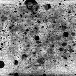
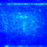
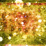
Infographic: Day in the Life of Visual Evolution
Have you ever wondered what a day in the life of Visual Evolution looks like?
Of course you haven’t, why would anyone give two hoots!
However, we did wonder what it looks like, and we used a couple of lovely pieces of software to help us visualise our day, or at the very least our on-screen journeys in a typical day. We have been collecting various pieces of data about our daily trends in the Visual Evolution office with a view to creating some interesting infographics, and in this, the first part of a little study we are conducting, we have looked at the journey our mouses made over the course of a working day.
Using a piece of software called IOGraph to track our mouse movements and a second program to generate a heat map based on these movements, we have produced a couple of lovely visualisations about our 8 hours in the office.
There’s much more to follow, so please come back and visit us soon for some more exciting work-based infographics!


No comments yet.